The definitive iPhone Duo guide for seasoned SwiftUI developers
iPhone Duo reports itself as an iPhone, yet your SwiftUI app now has seven layouts to get right. What breaks, what adapts for free, and how to fix the rest.
iPhone Duo reports itself as an iPhone. userInterfaceIdiom is .phone, there’s no new idiom to check, and there’s deliberately no API that tells you you’re running on one. On paper, nothing changed.
In practice, your app now has to look right in seven layouts on a single device: closed in portrait and landscape, open in portrait and landscape, folded like a book or a laptop, and in Split View next to another app. And it moves between them while it’s running, every time someone opens, folds or rotates the phone.
It’s tempting to file this under “an iPhone with an iPad-sized screen”. That undersells it. Closed, it’s wider and shorter than any iPhone before, with a camera in the corner and your toolbar on the side of the screen. Open, it’s regular × regular, the size class you used to treat as “iPad”. Navigation bars, toolbars and tab bars move into a vertical strip, NavigationSplitView shows columns you never designed, safe areas turn asymmetric, and the fold becomes a region your custom layouts have to stay out of.
If you’ve shipped SwiftUI apps for years, most of your instincts still hold. A few of them now quietly produce the wrong layout. This guide is for experienced developers who want to know what’s different, what you have to change, and what you can safely ignore. It covers the mental model first, then the specific components (with UIKit equivalents where they matter), then two playbooks: starting a new project and migrating an existing one.
TL;DR: the five things that change
- Your app resizes mid-session. Folding and unfolding is a size and trait change, not a relaunch. Your process keeps running.
- Regular × regular is no longer “iPad”. The inner display is horizontally and vertically regular, on an iPhone.
- Bars move to the side. In most poses, navigation bars, toolbars and tab bars share a vertical strip along the edge of the display. Only the inner display in portrait keeps classic horizontal bars.
- System containers do most of the work.
NavigationSplitView,TabView, sheets, alerts and menus adapt to every pose and avoid the fold automatically. Custom chrome doesn’t. - The new Duo APIs are optional.
ArrangementView,ReservedRegionandonHingeChangeare for custom layouts and special effects. You don’t need them to be a good Duo citizen.
The device, in developer terms
Hardware-wise, iPhone Duo has two displays, each with its own front camera, joined by a hinge. Your app lives on one of them at a time: the outer display when closed, the inner one when open.
- The outer display is what people use when the phone is closed. It’s wider and shorter than a classic iPhone screen, and its camera sits in a corner and is always visible.
- The inner display is the large one. Its camera hides behind the screen and only appears while it’s in use.
- The hinge lets people hold the phone partially folded, like a book, set it on a table like a laptop, or stand it on its edges like a tent.
Apple’s design guidance is very clear on one point: don’t design a layout per pose. Design for two size classes, compact (outer) and regular (inner), and let the layout flow between them. The poses are mostly a combination of which display and which orientation, plus one new thing: the fold.
Here are all seven layouts, with the classic iPhone for comparison. Pick one to see what your app gets:
One app, every pose
Pick a pose to see what your app gets: size classes, where the bars go, and whether the fold matters.
Classic iPhone, portrait
Single display
- Size classes
- W CompactH Regular
- Bars
- Horizontal: navigation bar on top, tab bar at the bottom.
- Fold
- None
The baseline most iPhone code was written against.
Classic iPhone, landscape
Single display
- Size classes
- W CompactH CompactRegular on Plus / Pro Max
- Bars
- Horizontal.
- Fold
- None
Many apps simply lock to portrait. That shortcut stops working on the Duo’s inner display, which ignores your supported orientations.
iPhone Duo closed, portrait
Outer display: wider and shorter than a classic iPhone.
- Size classes
- W CompactH Regular
- Bars
- Vertical, along the trailing edge, below the camera and status items.
- Fold
- None on this display
Same size classes as a classic iPhone in portrait, but a different shape. The camera always occludes the top-trailing corner, and your content gets the width next to the bar.
iPhone Duo closed, landscape
Outer display, rotated: the hinge is now on top.
- Size classes
- W CompactH Compact
- Bars
- Vertical, on the trailing edge, ending above the camera.
- Fold
- None on this display
A great “tent” pose. A split ArrangementView shows only its primary view here.
iPhone Duo open, portrait
Inner display, rotated so the fold runs horizontally.
- Size classes
- W RegularH Regular
- Bars
- Horizontal. This is the only Duo pose with classic top and bottom bars.
- Fold
- Present, inactive while flat
Regular × regular used to mean “iPad”. Whatever your app does in that branch now runs on an iPhone.
iPhone Duo open, landscape
Inner display, the way it opens: the fold runs vertically.
- Size classes
- W RegularH Regular
- Bars
- Vertical, on the trailing edge, same as when closed.
- Fold
- Present, inactive while flat
Controls stay on the side, so they don’t jump around when people open the phone.
Partially folded: book
Inner display, folded along a vertical crease.
- Size classes
- W RegularH Regular
- Bars
- Vertical, on the trailing edge.
- Fold
- Active division region, vertical
Folding doesn’t change size classes. The fold shows up as a reserved region instead. Split views, sheets, alerts and menus move away from it automatically.
Partially folded: laptop
Inner display, folded along a horizontal crease.
- Size classes
- W RegularH Regular
- Bars
- Horizontal (the inner display is in portrait).
- Fold
- Active division region, horizontal
Top half for viewing, bottom half for touch: interactive controls belong on the stable lower half.
Split View on the inner display
Inner display, two apps side by side.
- Size classes
- W AnyH AnyRead it at runtime
- Bars
- Vertical, on each app’s outer edge: the left app gets the left edge.
- Fold
- Depends on the pose
Every app takes part in Split View on iPhone Duo. Safe areas become asymmetric, so handle each side independently.
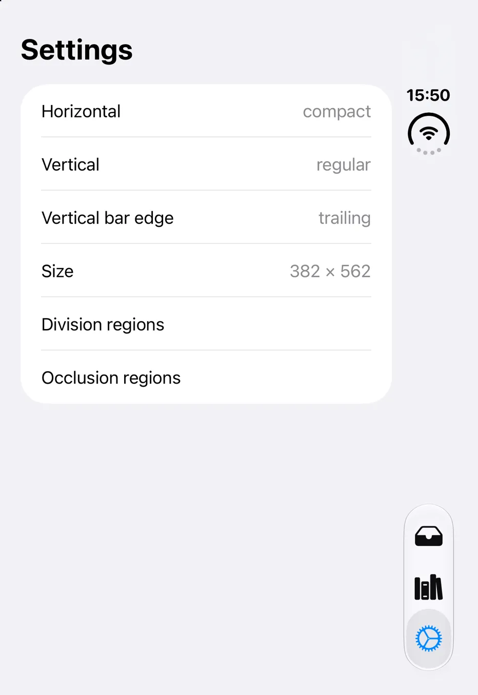
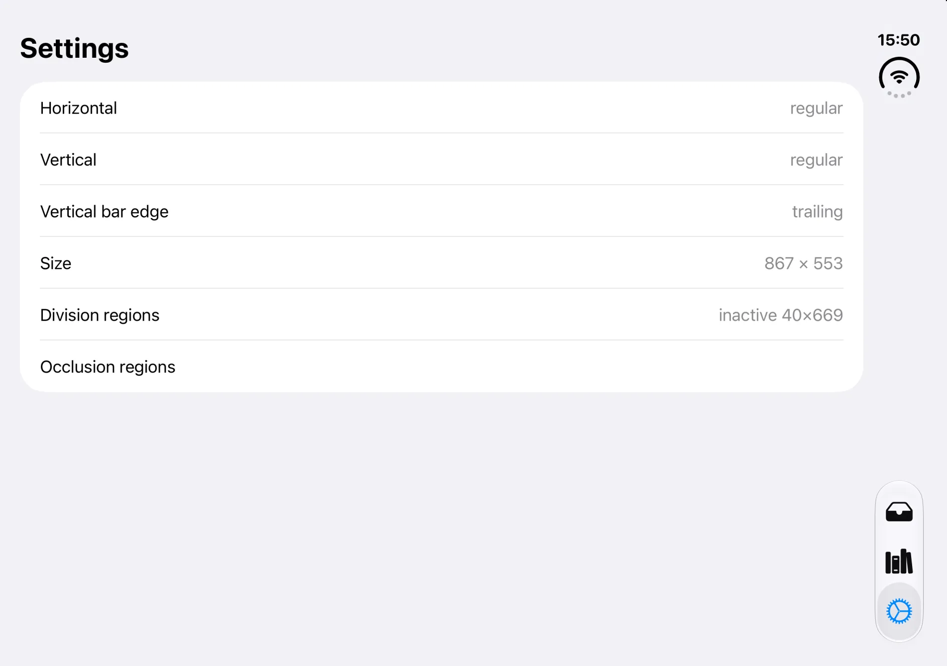
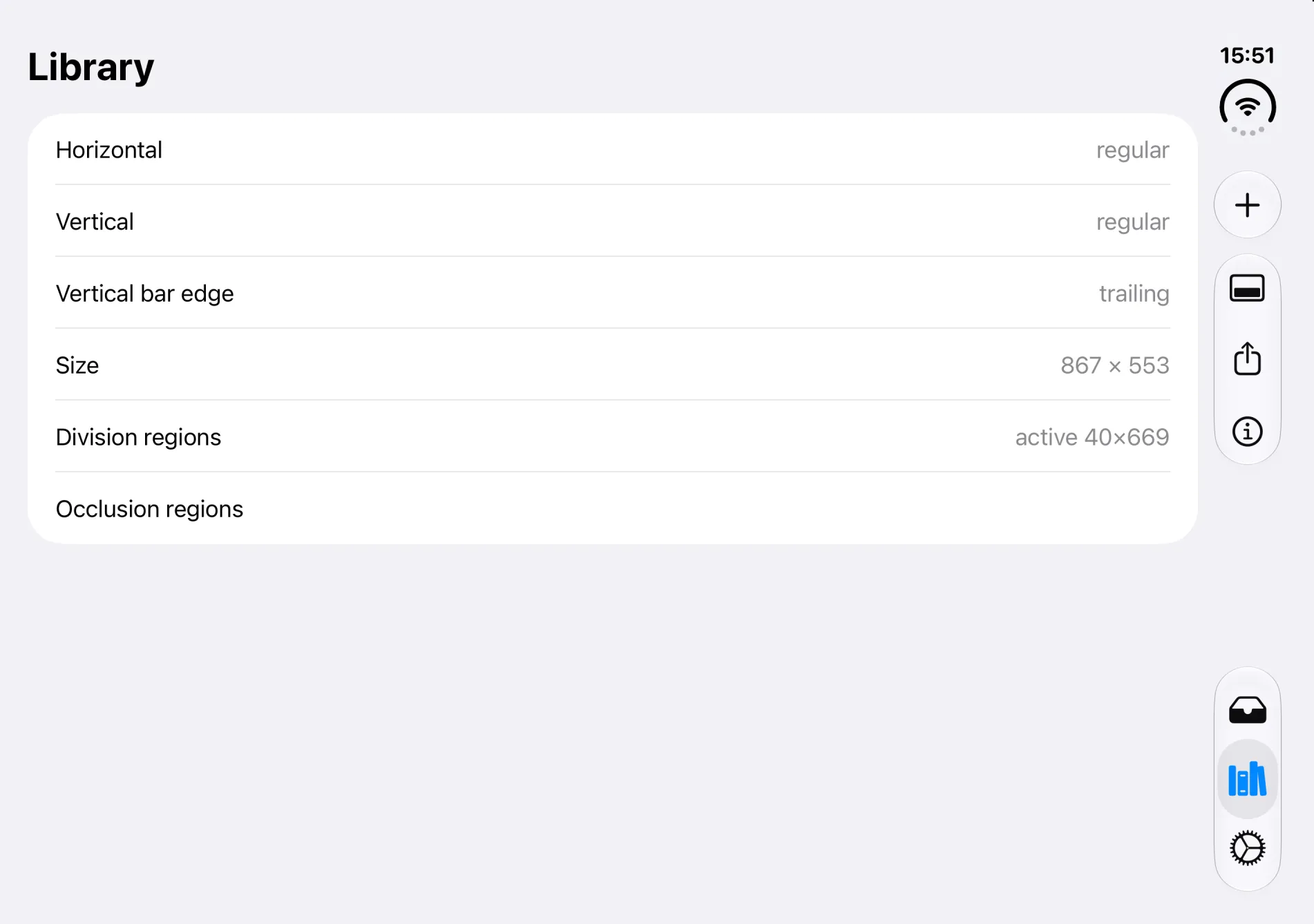
Here’s how that looks in the simulator. I put a small diagnostics screen in the test app that prints the current size classes, the vertical bar edge and the fold region:
Same screen, three poses (iPhone Duo simulator)
Size classes: the new map
If your mental model is “classic iPhone portrait = compact width, Duo closed = compact, Duo open = regular”, it’s correct. Apple’s exact wording from the Prepare your app talk:
On the outer display, like other iPhone models, iPhone Duo has regular vertical size class and compact horizontal size class in portrait, and compact vertical and horizontal size classes in landscape. On the inner display, the additional space lets you show more content like sidebars. As such, it has regular horizontal and vertical size classes.
Where each device state lands
Three consequences that are easy to miss:
1. “Regular” no longer implies iPad. Any code that says “if regular width, this must be the iPad layout” now runs that layout on an iPhone. Apple’s prepare checklist calls this out explicitly: search for userInterfaceIdiom == .pad and for code that treats horizontalSizeClass == .regular as iPad. There is no new idiom for iPhone Duo. It’s .phone.
2. Folding is not a size class. A partially folded inner display is still regular × regular. The fold shows up as a reserved region (more on that below). If your layout needs to react to the fold, size classes alone won’t tell you.
3. Orientation is not a layout signal anymore. The inner display doesn’t honor your supported interface orientations, so a portrait-locked app still gets landscape-shaped space when opened. Apple’s advice: stop checking orientation for layout decisions and use size classes and your container’s actual size instead.
// ✅ Branch on the size class, not on the device or orientation
struct LibraryRoot: View {
    @Environment(\.horizontalSizeClass) private var horizontalSizeClass

    var body: some View {
        if horizontalSizeClass == .regular {
            TwoColumnLibrary()      // inner display (and iPad)
        } else {
            SingleColumnLibrary()   // outer display (and classic iPhone)
        }
    }
}
And when you need actual dimensions, measure the container, not the screen:
// ❌ UIScreen.main.bounds: ambiguous on a two-display device,
//    and slated for deprecation
// ✅ Measure the space you were actually given
struct HeroHeader: View {
    @State private var width: CGFloat = 0

    var body: some View {
        Image("hero")
            .resizable()
            .aspectRatio(contentMode: width > 600 ? .fit : .fill)
            .onGeometryChange(for: CGFloat.self) { proxy in
                proxy.size.width
            } action: { newWidth in
                width = newWidth
            }
    }
}What happens when someone folds the phone
On iPhone Duo, “my app changed size” is a normal event, not an edge case:
- Your process stays alive. Apple’s DTS engineers put it as: treat display transitions as size-class and trait changes, not a scene disconnect or app termination.
- State mostly survives on its own. Text input and scroll position are generally preserved, video keeps playing, and in-memory form state persists because nothing restarted.
- Size can change at any moment. Reading the size once at launch or in
viewIsAppearingisn’t enough. In UIKit, do size-dependent work inlayoutSubviews/viewDidLayoutSubviews(orviewWillTransition(to:with:)); in SwiftUI, useGeometryReaderoronGeometryChange. UIRequiresFullScreendoesn’t stop it. The key is still honored, but your app resizes anyway when the device opens or closes. Apple recommends removing it (see TN3192).- Everyone does Split View. All apps take part in two-up multitasking on the inner display, and safe areas get asymmetric: vertical bars can sit on either side of your app.
How much of the display your app gets depends on the SDK you build with:
Same app, three SDKs
How much of the display your app gets depends on the SDK you build with, not on the iOS version it runs on.
Navigation containers: NavigationSplitView, TabView, NavigationStack
This is where seasoned iPhone developers get surprised, because these containers now take code paths that rarely ran on iPhone before.
NavigationSplitView
On a classic iPhone a NavigationSplitView collapses into a stack in practically every case (Plus/Max landscape aside). Plenty of iPhone-first apps use it as “a NavigationStack with a selection binding” and never think about the expanded state.
On iPhone Duo, Apple’s guidance is: closed, the columns collapse to single-stack navigation; open, they appear tiled and as overlays. So the expanded state, which you may never have designed, is now what every Duo owner sees when they open the phone.
One NavigationSplitView, four presentations
The same inbox: a list column and a detail column.
detail closure returns for a nil selection, a view that almost never appeared on a classic iPhone.Real behaviour (iPhone Duo simulator)
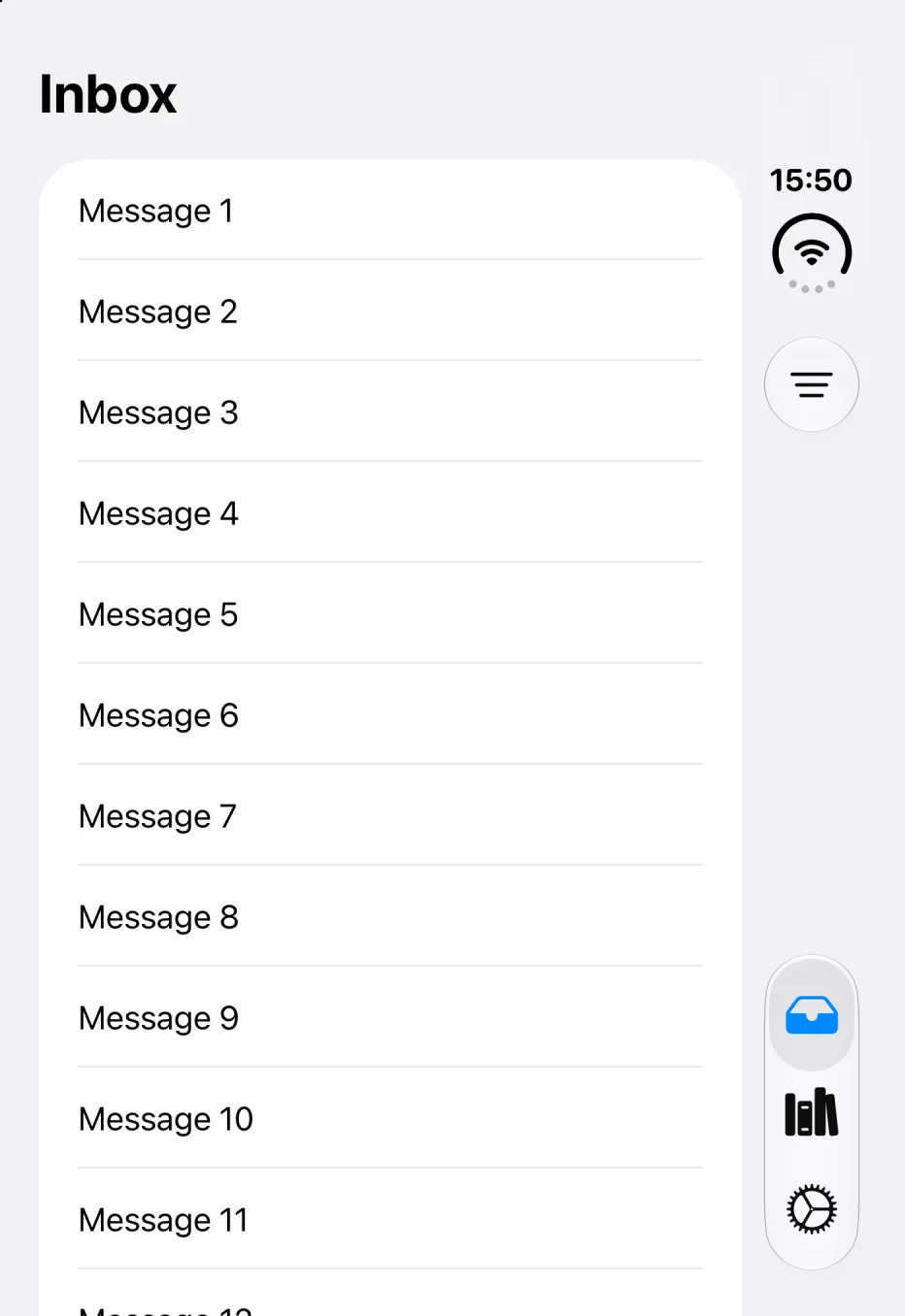
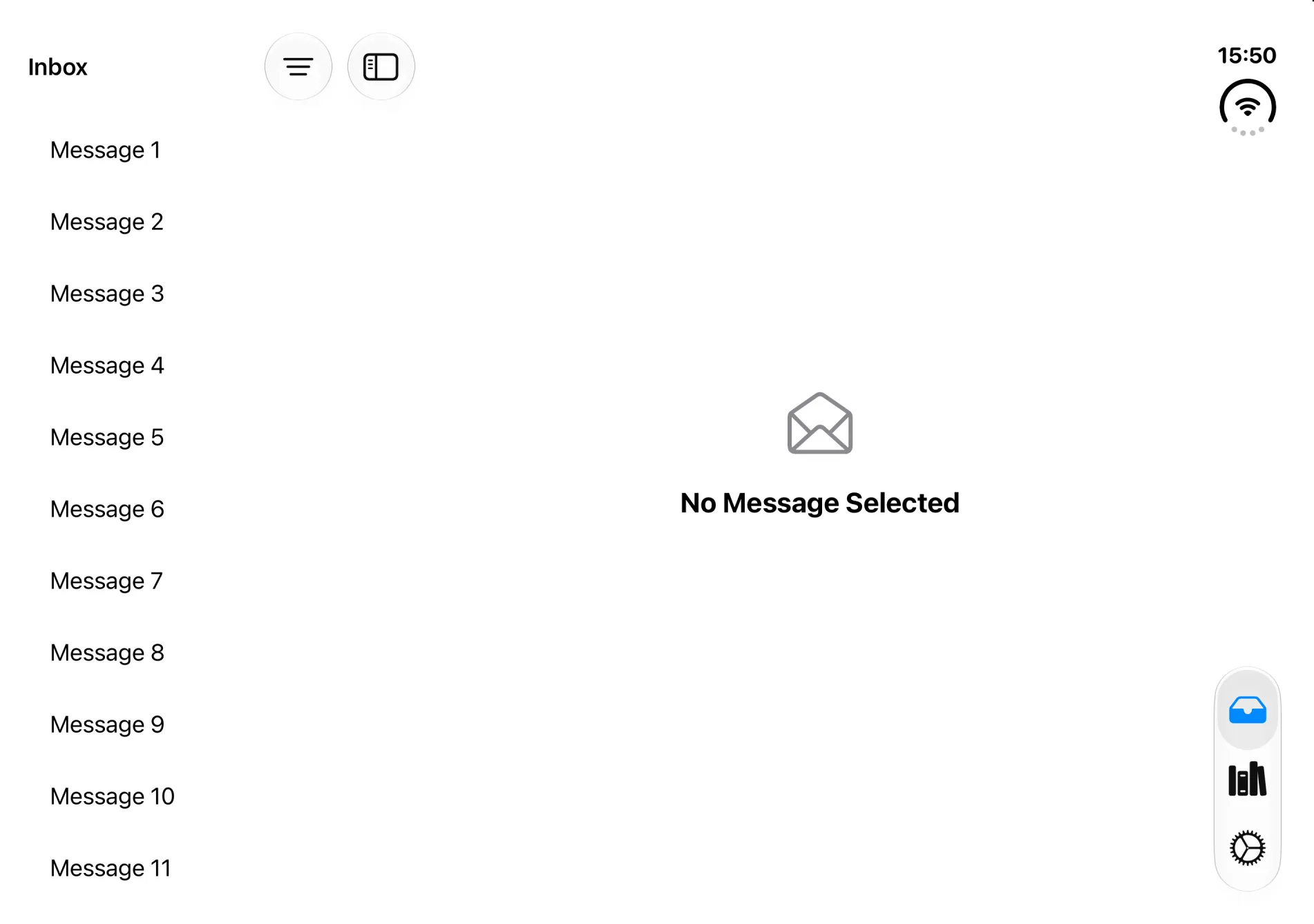
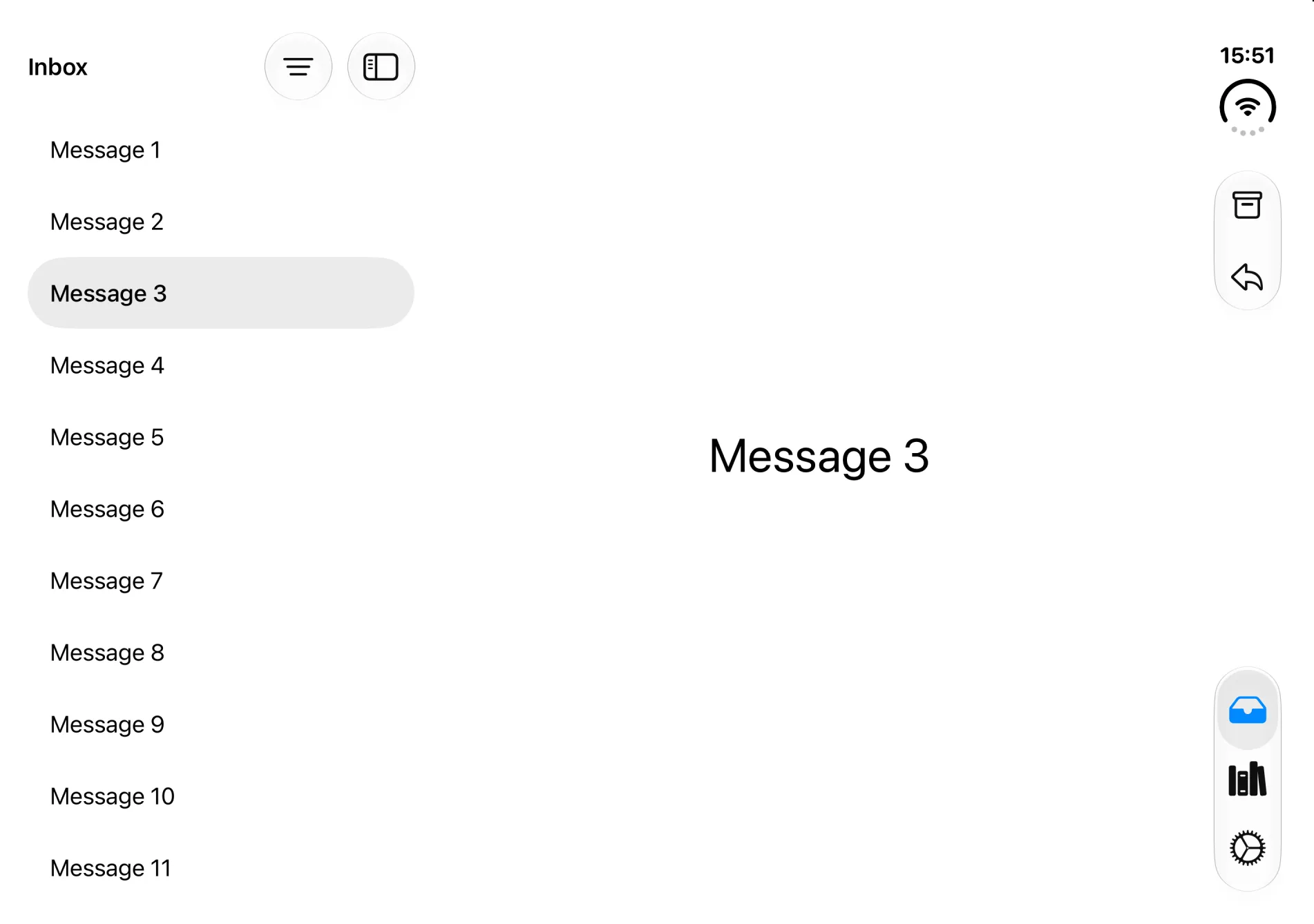
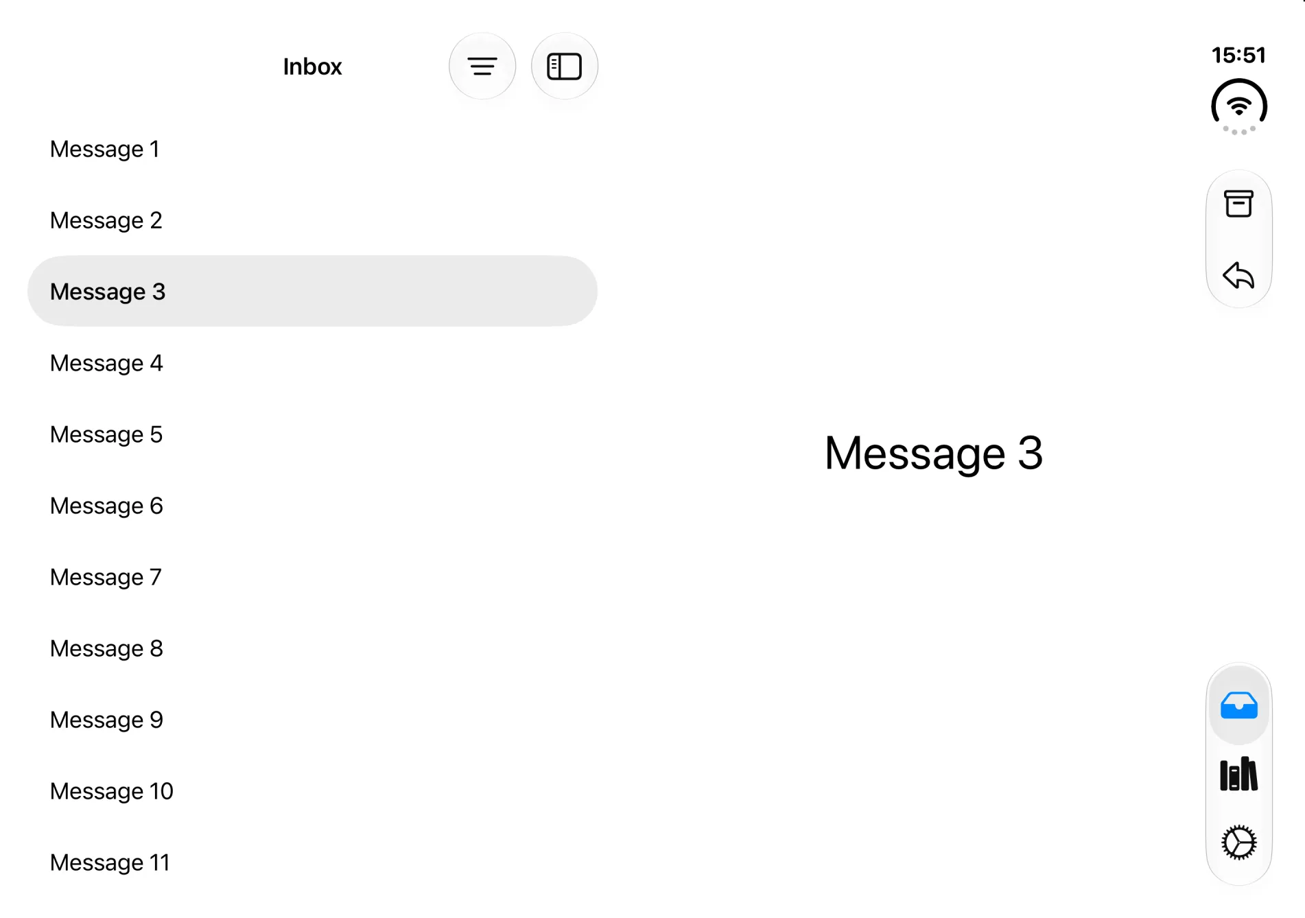
.bottomBar items (Archive, Reply) moved into the vertical bar automatically; the sidebar's Filter button stayed horizontal. When folded, the column split moved to the fold.What to do:
- Design the empty detail. Return a real
ContentUnavailableView(or a sensible default selection) for thenilcase. - Decide what a compact launch shows.
preferredCompactColumnlets you choose which column wins when collapsed. - Put the toolbar on the column it belongs to. Only the detail (trailing) column takes part in the vertical bar. Controls that act on the list should live on the list.
struct InboxSplitView: View {
    @State private var selection: Message.ID?
    @State private var compactColumn = NavigationSplitViewColumn.sidebar

    var body: some View {
        NavigationSplitView(preferredCompactColumn: $compactColumn) {
            List(Message.samples, selection: $selection) { message in
                MessageRow(message: message)
            }
            .navigationTitle("Inbox")
        } detail: {
            if let message = Message.samples.first(where: { $0.id == selection }) {
                MessageDetail(message: message)
            } else {
                // On classic iPhone you almost never saw this. On Duo you will.
                ContentUnavailableView("No Message Selected",
                                       systemImage: "envelope.open")
            }
        }
    }
}
TabView
By default, TabView adapts on its own: tabs are a classic bottom bar when the inner display is in portrait, and move to the bottom of the vertical side bar in every other pose. You don’t need to change anything.
What’s new is an opt-in sidebar for the inner display. Apple recommends it for information-dense apps:
TabView: the default vs. the sidebar opt-in
The default needs no code changes. The sidebar only changes the inner display.
TabView { … }Default.tabViewStyle(.sidebarAdaptable).defaultTabBarPlacement(.sidebar)Opt-indefaultTabBarPlacement(.sidebar) (iOS 27) turns the tabs into a sidebar on the inner display; closed, they stay tabs in the side bar (verified in the iPhone Duo simulator). Apple recommends the sidebar for information-dense apps.TabView(selection: $tab) {
Tab("Inbox", systemImage: "tray", value: .inbox) { InboxSplitView() }
Tab("Library", systemImage: "books.vertical", value: .library) {
NavigationStack { LibraryScreen() }
}
}
.tabViewStyle(.sidebarAdaptable)
.defaultTabBarPlacement(.sidebar) // iOS 27: sidebar where it fitsUIKit equivalent: tabBarController.mode = .tabSidebar and tabBarController.sidebar.preferredPlacement = .sidebar.
NavigationStack
NavigationStack needs no changes. Just make sure your toolbar items are attached inside it (see below). Apple’s Strike a pose talk lists navigation containers (NavigationStack, NavigationSplitView, TabView) and content containers (List, ScrollView) among the things that adapt to the fold for free.
Toolbars: the vertical bar
This is the biggest visual change, and the one most likely to need small code changes.
On the outer display (and on the inner display in landscape), the system takes everything that used to live in the top and bottom bars (back button, toolbar items, tab bar) and stacks it in a single vertical strip along the edge, next to the status bar and Dynamic Island. Because the strip is aligned with the hardware, it stays on the same side even in right-to-left languages.
Anatomy of the vertical bar (outer display)
- 1Camera, status bar & Dynamic Island
System elements share the side region with your controls. The Dynamic Island grows vertically for Live Activities.
- 2Back / Close
Automatic with a navigation container. Custom close buttons go in
.cancellationAction. - 3Prominent action
“Done”, “Add”… use
.topBarPinnedTrailing(UIKit:pinnedTrailingGroup). - 4Top-bar items, then bottom-bar items
Your groups keep their order; the system adds a gap between items that came from the top and bottom bars.
- 5Overflow menu
When space runs out, items collapse into ⋯, from the bottom up by default. Tune it with
visibilityPriority. - 6Tab bar
Tabs sit at the bottom of the same region. Who compresses first, toolbar items or tabs, is configurable.
Do you have to change your toolbar code?
If you use .toolbar inside a NavigationStack/NavigationSplitView (or bar items on a UINavigationController), the vertical bar just works after you rebuild. What needs attention:
| If your app… | What happens on Duo | Fix |
|---|---|---|
Builds its own bar from UIToolbar, UINavigationBar, UITabBar, or a custom view pinned to the bottom |
Content of custom bars isn’t considered for the vertical bar | Move items to the navigation container’s toolbar |
| Has text-only toolbar items | Items with only a title never go vertical; they stay in a horizontal bar | Give every item a title and a symbol (Button("Reply", systemImage: …)) |
| Uses custom views (segmented controls, cart totals…) as items | Custom views aren’t placed vertically by default | Keep them .horizontalOnly, or opt in with .verticalPreferred and adapt the layout |
| Has many items | They overflow into ⋯, bottom-up | Set visibilityPriority, and move your own “more” menu into ToolbarOverflowMenu |
| Adds fixed spacers for alignment | Flexible spacers collapse to zero vertically; fixed ones don’t | Use ToolbarItemGroup instead of manual spacing |
| Is a full-screen, non-scrolling UI (calculator, video player) | The side bar steals width you need | toolbarVerticalBehavior(.disabled) for that screen |
Here’s a toolbar written the “Duo-friendly” way. The first version uses nothing new, so it compiles with any recent SDK:
MessageDetail(message: message)
    .toolbar {
        ToolbarItem(placement: .cancellationAction) {       // top of the vertical bar
            Button("Close", systemImage: "xmark") { dismiss() }
        }
        ToolbarItemGroup(placement: .bottomBar) {           // grouped, title + symbol
            Button("Archive", systemImage: "archivebox") { }
            Button("Reply", systemImage: "arrowshape.turn.up.left") { }
        }
    }
And here it is tuned with the iOS 27/27.1 APIs:
.toolbar {
    ToolbarItem(placement: .cancellationAction) {
        Button("Close", systemImage: "xmark") { dismiss() }
    }
    ToolbarItem(placement: .topBarPinnedTrailing) {        // prominent action
        Button("Done", systemImage: "checkmark") { }
    }
    ToolbarItemGroup(placement: .bottomBar) {
        Button("Reply", systemImage: "arrowshape.turn.up.left") { }
        Button("Archive", systemImage: "archivebox") { }
    }
    .visibilityPriority(.high)                              // overflow these last

    ToolbarItem {
        Button("Filter", systemImage: "line.3.horizontal.decrease") { }
    }
    .axisBehavior(.horizontalOnly)                          // never in the side bar

    ToolbarOverflowMenu {                                   // your "more" items
        Button("Print", systemImage: "printer") { }
        Button("Move to Junk", systemImage: "xmark.bin") { }
    }
}
Toolbar vs. tab bar: who gives way?
When the side bar runs out of room (often in landscape on the outer display, or when the keyboard appears) something has to compress. By default toolbar items overflow first so tabs stay reachable. That suits navigation-heavy apps. For task-focused screens, flip it:
TabView {
    Tab("Recents", systemImage: "clock") {
        NavigationStack {
            RecentsView()
                .toolbarVerticalCompressionBehavior(.prefersToolbarItems)
        }
    }
}
UIKit: navigationItem.verticalBarCompressionBehavior = .prefersBarItems.
Custom chrome next to the bar
If you draw your own floating controls, read which edge the system bar uses so you don’t collide with it. toolbarVerticalEdge is nil wherever no vertical bar is ever used (classic iPhones, inner display in portrait):
struct PaletteHost: View {
    @Environment(\.toolbarVerticalEdge) private var verticalEdge

    var body: some View {
        FloatingToolPalette()
            .frame(maxWidth: .infinity, maxHeight: .infinity,
                   alignment: verticalEdge == .leading ? .trailing : .leading)
    }
}
UIKit: traitCollection.verticalBarEdge.
Sheets and other presentations
Sheets need no code changes to work, but they look different, and one modifier is worth knowing.
The same .sheet in three poses (iPhone Duo simulator)
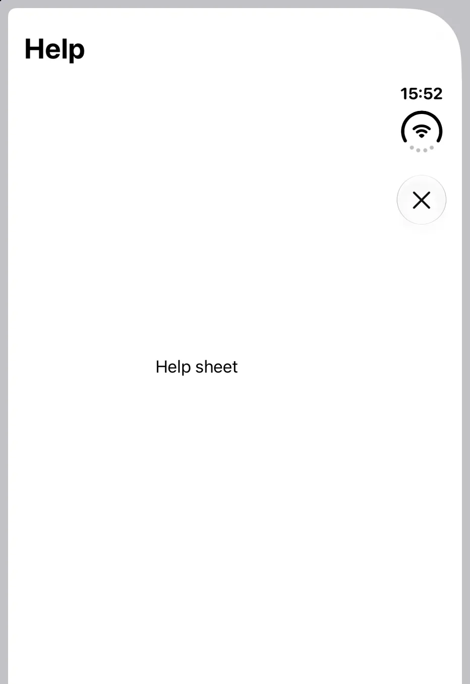
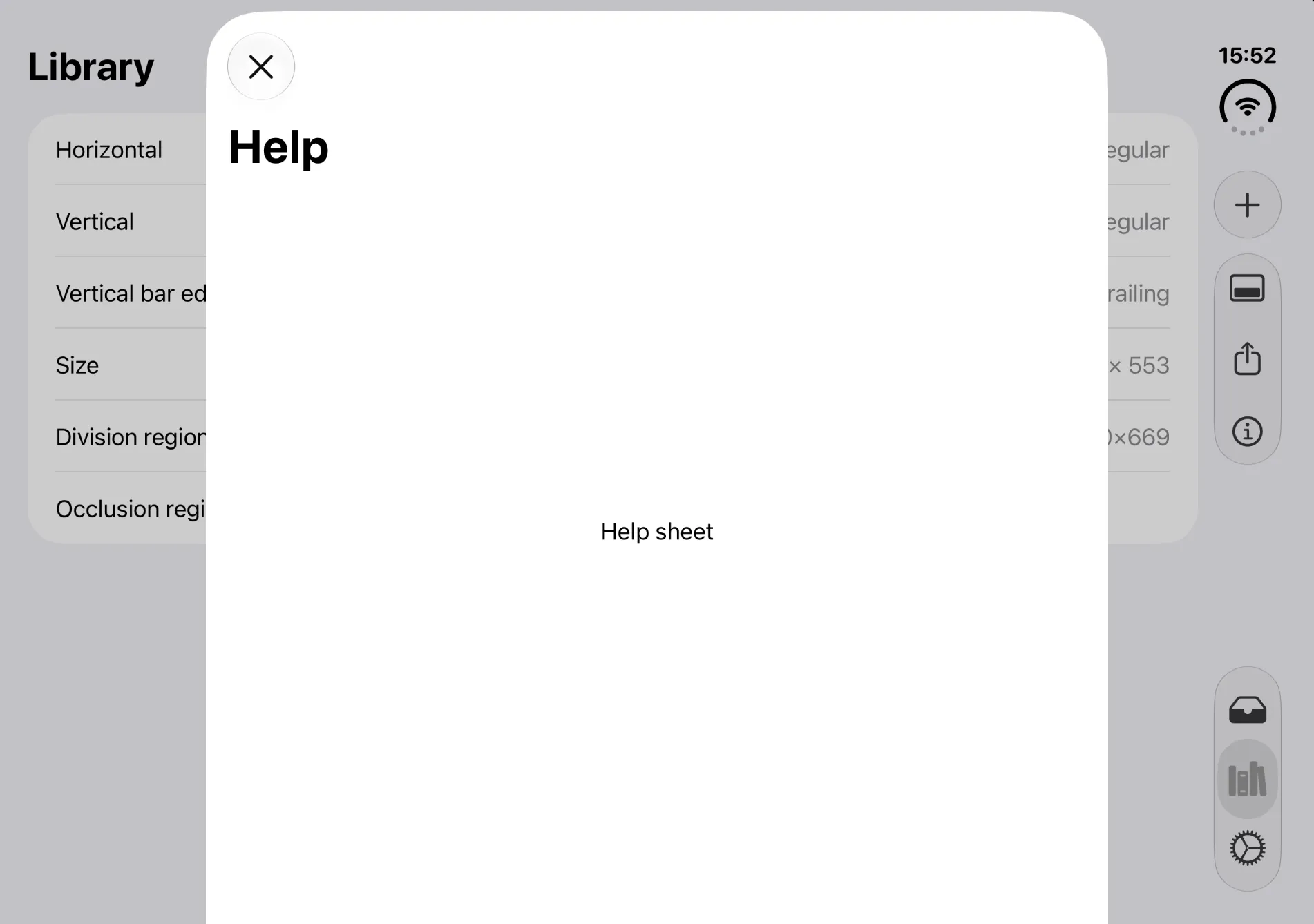
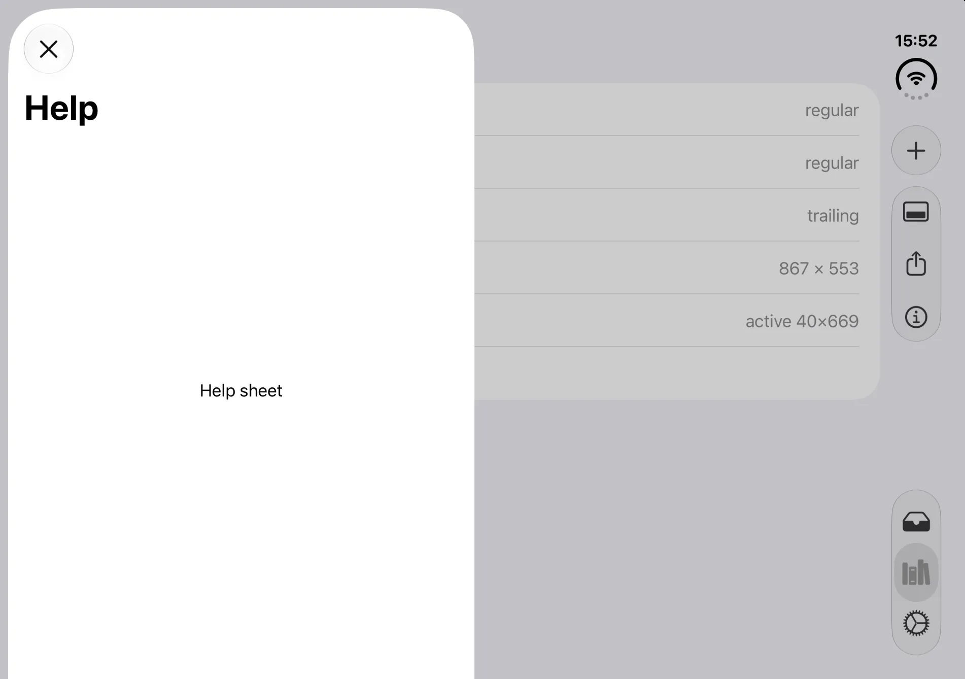
Closed: if the sheet has a toolbar, its items go vertical. For a sheet with a single Close button, that vertical strip wastes width. Apple suggests turning it off there:
.sheet(isPresented: $showHelp) {
    NavigationStack {
        HelpView()
            .toolbar {
                ToolbarItem(placement: .cancellationAction) {
                    Button("Close", systemImage: "xmark") { showHelp = false }
                }
            }
    }
    .toolbarVerticalBehavior(.disabled)   // iOS 27.1: keep this sheet's bar horizontal
}
The modifier is resolved per window or presentation, so inside a sheet it affects only the sheet. In a NavigationStack the top view wins, in a TabView the selected tab, in a NavigationSplitView the trailing column. Apple asks you to keep it stable: don’t toggle it as state changes.
Open: sheets are centered by default. With the new presentationPlacement(_:) you can pin them to an edge, which also decides whether they get a vertical bar:
Sheets on the inner display: placement decides the bar
presentationPlacement(_:) (SwiftUI, iOS 27) or preferredPlacement on UISheetPresentationController. Behaviour per Apple’s Preparing your app for iPhone Duo.Map()
.sheet(isPresented: $isPresented) {
PlaceDetailView()
.presentationDetents([.medium, .large])
.presentationPlacement(.leading) // iOS 27: keep the map visible
}The Duo-only APIs: do you need them?
Short answer: no, not to ship a good Duo app. Everything above uses containers you already know. The new APIs are for custom layouts the system can’t reason about, and for experiences that only make sense on a foldable.
How far do you need to go?
- 0Rebuild with Xcode 27.1+Required
Without the iOS 27.1 SDK your app is centered or kept beside the status bar instead of using the full display.
- 1Resizing hygieneRequired
Stop reading the screen, idiom or orientation. Lay out from size classes, container size and safe areas.
horizontalSizeClassonGeometryChangesafeAreaInsets - 2Bars & presentationsStrongly recommended
Use system containers, give every toolbar item a title and a symbol, set priorities, decide per sheet.
axisBehaviorvisibilityPrioritytoolbarVerticalBehaviorpresentationPlacement - 3Fold-aware layoutsOptional
For custom two-pane or overlay layouts and hand-placed controls that could land in the fold.
ArrangementViewReservedRegion - 4Duo-only experiencesOptional
Hinge-driven effects, camera previews on the outer display, multiple windows.
onHingeChangeCameraCaptureAccessory
The APIs in this section are iOS 27.1+. If you deploy to older versions, wrap them in one place (see Adopting without the mess) instead of sprinkling #available across your views.
ArrangementView: two views, every pose
ArrangementView (UIKit: UIArrangementViewController) lays out a primary and a secondary view based on size class, orientation and the fold. Think of it as a smart HStack/VStack/ZStack that knows about the hinge.
ArrangementView: where primary (P) and secondary (S) go
.arrangementViewStyle(.split)Two views, never on top of each other.arrangementViewStyle(.overlay)Layered when flat, separated when foldedArrangementView documentation (iOS 27.1). Limit the axes with .split.axes(.horizontal): in a tall container, a horizontal-only split shows just the primary view.NavigationStack {
ArrangementView {
NowPlayingView() // primary
} secondary: {
UpNextView() // secondary
}
.arrangementViewStyle(.split) // or .overlay, or .split.axes(.horizontal)
}When to reach for it. If you already have an HStack/VStack of two related panes, it translates to .split. If you have a ZStack with a clear foreground/background relationship (controls over video, a reader over an article), that’s .overlay.
Rules from Apple’s docs:
- Keep navigation outside. Don’t put a
NavigationSplitVieworTabViewinside an arrangement view; wrap the arrangement in your navigation container instead. - Don’t put it inside a
List,ScrollView, grid or split view either. - Use
@Environment(\.overlayArrangementZIndex)(UIKit:state(for:)) when a view should collapse while it’s layered underneath.
ReservedRegion: the fold and the cameras as data
The system describes areas you shouldn’t put content in as reserved regions:
.occlusion: something covers your view (the outer camera, always; the inner camera, only while active)..division: something splits your view (the fold, active only while partially folded).
Most apps never query these. Split views, tab bars, sheets, alerts and menus already avoid them. Check them yourself only where your own code positions controls: floating buttons, custom overlays, custom Layouts, grids that look bad split down the middle.
A small but nice example. Apple’s HIG suggests preferring an even number of grid columns whenever a fold exists, active or not, so content divides cleanly:
@available(iOS 27.1, *)
struct FoldAwareGrid: View {
    let items = Array(0..<40)

    var body: some View {
        GeometryReader { proxy in
            let hasFold = !proxy.reservedRegions(
                kind: .division, options: .includeInactive
            ).isEmpty
            let fitting = max(1, Int(proxy.size.width / 160))
            let count = hasFold && fitting.isMultiple(of: 2) == false
                ? fitting + 1 : fitting

            ScrollView {
                LazyVGrid(columns: Array(repeating: GridItem(.flexible()), count: count)) {
                    ForEach(items, id: \.self) { ItemTile(index: $0) }
                }
                .padding()
            }
        }
    }
}
Including inactive regions also keeps the layout from jumping the moment someone starts folding. In the simulator, the fold reported a 40-point-wide region spanning the full height of the open display.
onHingeChange: for effects, not layout
onHingeChange (UIKit: UIHingeInteraction) streams the hinge status (.closed, .partiallyOpen, .fullyOpen) and its continuous angle. Apple is explicit: use it for interactions and effects, and use arrangement and region APIs for layout. Update rate and granularity are system policy and can change.
@available(iOS 27.1, *)
struct InstrumentView: View {
    @State private var bend: Double = 0

    var body: some View {
        GuitarView(bend: bend)
            .onHingeChange { _, context in
                // context.hinge is nil on devices without a hinge
                if let hinge = context.hinge, hinge.status == .partiallyOpen {
                    bend = 1 - min(max(hinge.angle.degrees / 180, 0), 1)
                } else {
                    bend = 0
                }
            }
    }
}
There’s no single “pose” value. If you really need to detect tabletop vs. book, combine the hinge status, the division region’s direction and the size class. Treat that as a last resort.
Also new: scenes and the camera
- Multiple windows. iPhone Duo is the first iPhone that supports multiple instances of your UI, but only on the inner display. Request scenes with
UIWindowSceneActivationAction, which hides itself when new windows aren’t available, and handle errors. - Camera capture accessory. Camera apps can show extra UI on the outer display (a teleprompter, or a preview for the person being photographed) with
.sceneAccessory { CameraCaptureAccessory { … } }. It’s only available full screen on the inner display with an active capture session, and the system can withdraw it at any time. - Choosing cameras. Opening and closing can flip which way “the front camera” faces. Select cameras by facing direction and let
AVCaptureDeviceDirectionCoordinatortrack it.
Adopting without the mess
The fear with new APIs is ending up with if #available and device checks everywhere. The pattern that works: put every Duo-specific decision behind a small, named abstraction, so feature code reads like normal SwiftUI.
1. Modifiers for one-line opt-ins. Your screens call .horizontalBarsOnly(); only this file knows about iOS 27.1:
extension View {
    /// For control-light sheets: keep the single close button horizontal.
    @ViewBuilder
    func horizontalBarsOnly() -> some View {
        if #available(iOS 27.1, *) {
            self.toolbarVerticalBehavior(.disabled)
        } else {
            self
        }
    }

    /// Opt-in: show the tabs as a sidebar where the layout is wide enough.
    @ViewBuilder
    func sidebarOnInnerDisplay() -> some View {
        if #available(iOS 27.0, *) {
            self.defaultTabBarPlacement(.sidebar)
        } else {
            self
        }
    }
}
2. The same for toolbar content. ToolbarContentBuilder supports if #available, so item-level options work the same way:
extension ToolbarContent {
    @ToolbarContentBuilder
    func horizontalOnlyOnDuo() -> some ToolbarContent {
        if #available(iOS 27.1, *) {
            self.axisBehavior(.horizontalOnly)
        } else {
            self
        }
    }
}
3. A layout component with a fallback. Feature code asks for “a pair of views”. On iOS 27.1+ that’s an ArrangementView; before that, a plain stack that picks its axis from the available space:
struct AdaptivePair<Primary: View, Secondary: View>: View {
    @ViewBuilder var primary: Primary
    @ViewBuilder var secondary: Secondary

    var body: some View {
        if #available(iOS 27.1, *) {
            ArrangementView {
                primary
            } secondary: {
                secondary
            }
            .arrangementViewStyle(.split)
        } else {
            GeometryReader { proxy in
                let layout = proxy.size.width > proxy.size.height
                    ? AnyLayout(HStackLayout(spacing: 0))
                    : AnyLayout(VStackLayout(spacing: 0))
                layout {
                    primary.frame(maxWidth: .infinity, maxHeight: .infinity)
                    secondary.frame(maxWidth: .infinity, maxHeight: .infinity)
                }
            }
        }
    }
}

// Feature code stays boring:
AdaptivePair { NowPlayingView() } secondary: { UpNextView() }
When you eventually raise your deployment target to 27.1, you delete the else branches in one file and you’re done.
4. Never detect “is this an iPhone Duo?” There’s no API for it on purpose. Branch on the capability you care about: size class, available width, toolbarVerticalEdge != nil, a division region. That way the same code is right on iPad, in iPhone Mirroring, in Split View, and on whatever ships next.
Playbook: a new project, Duo-first
If you’re starting fresh, these defaults get you 90% of the way without touching a Duo-specific API:
- Build with Xcode 27.1 or later. The full-display experience requires the iOS 27.1 SDK.
- SwiftUI lifecycle, scene-based. Plan for more than one window:
UserDefaults/@AppStorageare app-wide, so per-window state belongs in@SceneStorageor your model. - Root =
TabViewwithTab(_:systemImage:)items: icon plus title, always. Add.tabViewStyle(.sidebarAdaptable)+.defaultTabBarPlacement(.sidebar)only if your app is information-dense and your tabs hostNavigationStacks. - Each tab =
NavigationStackorNavigationSplitView. Use the split view where list → detail is the core flow (mail, notes, files), and design its empty detail state on day one. - Toolbars live inside navigation containers, use semantic placements (
.cancellationAction,.topBarPinnedTrailing,.bottomBar), group related items, and give everything a title and a symbol. - Layout from size classes and container size, never
UIScreen, idiom or orientation. Support every orientation; the inner display ignores the list anyway. - Two-pane custom screens →
AdaptivePair(anArrangementViewunderneath). - Test in four places: iPhone Duo simulator (closed, open, folded, rotated, Split View), an iPad simulator, iPhone Mirroring resized to extremes, and a classic iPhone.
@main
struct DuoReadyApp: App {
    var body: some Scene {
        WindowGroup { RootView() }
    }
}

enum AppTab: Hashable { case inbox, library, settings }

struct RootView: View {
    @State private var tab: AppTab = .inbox

    var body: some View {
        TabView(selection: $tab) {
            Tab("Inbox", systemImage: "tray", value: .inbox) {
                InboxSplitView()                 // list → detail
            }
            Tab("Library", systemImage: "books.vertical", value: .library) {
                NavigationStack { LibraryScreen() }
            }
            Tab("Settings", systemImage: "gear", value: .settings) {
                NavigationStack { SettingsScreen() }
            }
        }
    }
}
Playbook: migrating an existing app
Work through this in order. Each step is independently shippable.
Step 1: Rebuild and look
Build with Xcode 27.1, run the iPhone Duo simulator, and walk every screen, sheet and popover in each pose: closed, open, partially folded, rotated, and in Split View on both sides. Note anything centered awkwardly, controls sitting in the fold, and bars that didn’t go vertical.
Step 2: Grep for the classic assumptions
# Screen-based sizing
rg -n "UIScreen\.main|UIWindow\(frame: UIScreen"
# Idiom / device checks
rg -n "userInterfaceIdiom|UIDevice\.current\.model|\.pad\b"
# Orientation-driven layout
rg -n "UIDevice\.current\.orientation|statusBarOrientation|interfaceOrientation"
# Hard-coded device sizes
rg -n "== ?(812|844|852|874|926|932|956)\b"
# Symmetric safe-area math
rg -n "safeAreaInsets\.(left|right) \* 2"
# Custom bars that won't go vertical
rg -n "UIToolbar\(|UITabBar\(|UINavigationBar\("
Typical replacements:
| Old | New |
|---|---|
UIScreen.main.bounds |
view.bounds, window.bounds, GeometryReader, onGeometryChange |
UIScreen.main.scale |
traitCollection.displayScale / @Environment(\.displayScale) |
UIWindow(frame: UIScreen.main.bounds) |
UIWindow(windowScene:) |
Stored UIScreen |
view.window?.windowScene?.screen |
idiom == .pad → iPad layout |
horizontalSizeClass == .regular → wide layout |
| Orientation checks | Compare the container’s width and height |
width - insets.left * 2 |
bounds.inset(by: safeAreaInsets).width |
Step 3: Audit the bars
Move custom bars into navigation containers, give every item a symbol, assign visibilityPriority to your most-used actions, move a home-grown “more” menu into ToolbarOverflowMenu, and decide per sheet whether a vertical bar makes sense.
Step 4: Fix the expanded states
Every NavigationSplitView needs a designed empty state and a sensible column layout. Every “regular width” branch should look intentional at the inner display’s size. Apple’s design guidance: on the inner display, your app should look like a natural extension of its iPad layout, and show an extra level of hierarchy only where it helps.
Step 5: Only now, the fold
Look at the screenshots from step 1 in the folded pose. If something custom sits in the crease, use ArrangementView for two-pane screens or ReservedRegion for individual controls. If nothing does, you’re done.
Step 6: Ship it
Upload iPhone Duo screenshots in App Store Connect to get the “optimized for iPhone Duo” badge on your product page. Starting April 2027, all app submissions must include iPhone Duo screenshots.
Cheat sheet
| Goal | SwiftUI | UIKit | Since |
|---|---|---|---|
| Sidebar tabs on the inner display | .defaultTabBarPlacement(.sidebar) |
sidebar.preferredPlacement = .sidebar |
iOS 27.0 |
| Turn off the vertical bar | .toolbarVerticalBehavior(.disabled) |
override preferredVerticalBarBehavior |
iOS 27.1 |
| Keep an item horizontal / prefer vertical | .axisBehavior(.horizontalOnly / .verticalPreferred) |
item.axisBehavior |
iOS 27.1 |
| Overflow order | .visibilityPriority(.high) |
item.visibilityPriority |
iOS 27.0 |
| Your own overflow items | ToolbarOverflowMenu { … } |
navigationItem.additionalOverflowItems |
iOS 27.0 / 16.0 |
| Toolbar vs. tab bar compression | .toolbarVerticalCompressionBehavior(_:) |
navigationItem.verticalBarCompressionBehavior |
iOS 27.1 |
| Which edge is the bar on? | @Environment(\.toolbarVerticalEdge) |
traitCollection.verticalBarEdge |
iOS 27.1 |
| Sheet on an edge | .presentationPlacement(.leading) |
sheetPresentationController.preferredPlacement |
iOS 27.0 |
| Two-pane adaptive layout | ArrangementView |
UIArrangementViewController |
iOS 27.1 |
| Fold / camera geometry | proxy.reservedRegions(kind:options:) |
view.reservedRegions(kind:options:) |
iOS 27.1 |
| Hinge angle & status | .onHingeChange { old, new in } |
UIHingeInteraction |
iOS 27.1 |
| Outer-display camera UI | .sceneAccessory { CameraCaptureAccessory { … } } |
registerSceneAccessory(_:) |
iOS 27.1 (accessory) |
Sources
Apple:
- Preparing your app for iPhone Duo (documentation)
- Designing for iPhone Duo (Human Interface Guidelines)
- Prepare for iPhone Duo (step-by-step checklist)
- Tech talks: Prepare your app for iPhone Duo · Raise the bar with iPhone Duo · Strike a pose with adaptive layouts · Leverage multiple displays and scenes · Design for iPhone Duo
- API reference: ArrangementView · ReservedRegion · onHingeChange(isEnabled:_:) · toolbarVerticalBehavior(_:) · presentationPlacement(_:) · defaultTabBarPlacement(_:)
- A Summary of the iPhone Duo Group Lab (Apple Developer Forums, DTS)
- TN3192: Migrating your app from the deprecated UIRequiresFullScreen key
Community:
- Natalia Panferova, Configuring SwiftUI toolbars on iPhone Duo
Found something that behaves differently on real hardware? Let me know and I’ll update the guide.